
By Darya Petrov
Author’s Note: I worked on this research project at the peak of the COVID-19 pandemic, while we were fully remote and on lockdown. I chose this topic because it was extremely relevant given the circumstances. I hope this report conveys the importance and value of the union of statistical modeling and public health in pandemic response efforts.
1 Introduction:
The coronavirus pandemic has been ongoing since the beginning of 2020. As of April 11, 2022, there have been 497 million confirmed cases of which 6 million resulted in death worldwide [1]; the recent World Health Organization (WHO) report on the pandemic indicates that this massive number itself is probably a significant underestimate [2]. Our understanding of the evolution of the coronavirus has dictated many large-scale social distancing measures including mask mandates, lock-downs, and travel restrictions that have had major impacts on society, economy, and public health. Conventional epidemiological models of infectious diseases, such as the SIR (Susceptible, Infected, Recovered) model which measures the spread of a disease through the change of the population in each of the three compartments listed, do not readily apply to COVID-19 dynamics; they do not utilize information on the count of asymptomatic individuals, an unobservable variable. It is well-known that asymptomatic but infected individuals have been the major spreaders of the COVID-19 pandemic, and therefore, it is imperative to obtain an estimate of such individuals in the population from available data. India is an excellent candidate for the analysis of disease dynamics because at one point during the pandemic, it had the worst COVID-19 crisis in the world. On May 6th, 2021, India had the largest worldwide single-day spike of over 400,000 new infections with shortages of hospital beds and ventilators [3]. We analyze publically available data from the state of Kerala in India to gain a better understanding of COVID-19 dynamics using a previously proposed methodology. The model is expressed through a system of difference equations, and incorporates information on social distancing measures and diagnostic testing rates to characterize the dynamics of the pandemic. The model’s key feature is its ability to estimate the unobservable count of asymptomatic individuals mentioned previously. This methodology has already been used to analyze COVID-19 dynamics in the United States [4].
2 Methods:
2.1 The Model
A graphical representation of the disease propagation model is depicted in Figure 1. The color of each box represents the observability of the compartment: red indicates unobserved, blue indicates observed, and purple indicates partially observed, meaning the compartments are observed together. Suppose at time t, Ct , Dt , Tt respectively represent the number of confirmed COVID-19 cases, number of deaths due to the disease, and number of tests performed up to time t. Let At denote the number of asymptomatic individuals, of which Ht denotes the number of persons hospitalized and Qt denotes those quarantined due to COVID-19 at time t. St denotes the number of susceptible individuals in the population at time t. Rt denotes the number of recovered individuals, of which RtQ, RtH, RtA respectively are those recovered from quarantine, hospitalization, or from being asymptomatic but never quarantined or hospitalized.

Figure 1: Graphical representation of the disease propagation model
2.2 Data Preprocessing
We consider the dynamics of the spread of COVID-19 in Kerala, India for a time window of April 1, 2020 to December 31, 2020. The proposed model is based on the observed state-wise daily counts of confirmed infections, deaths, hospitalizations and reported recoveries. Daily counts of the confirmed COVID-19 cases, recoveries, deaths, tests, and hospitalizations were obtained from an application programming interface (API) [5]. Daily hospitalizations were obtained from a state dashboard owned by the Kerala government [6]. Unfortunately, obtaining hospitalization data for India was arduous. We extracted the data manually for each district in Kerala for each day, and then combined the data into one data frame. The social mobility data was obtained from Google [7]. The data was preprocessed and cleaned, removing any irregularities present such as abnormally large counts for a given day that are clearly due to a mistake in the data reporting. Getting rid of such outliers is crucial because they can have a significant impact on the model and distort the actual relationships and patterns in the data. These irregularities or any missing observations were replaced using K-Nearest Neighbor (KNN) imputation with k=6 nearest neighbors, i.e. a missing observation for a given day was replaced by the average of the six closest observations by date. Inherent noise present in the daily counts, visually represented by frequent vertical spikes on a graph, were removed by pre-smoothing the trajectories using the Locally Estimated Weighted Scatterplot Smoothing (LOWESS) method with bandwidth 1/16. This fits smooth curves to the data points to capture general patterns in the data, with the bandwidth indicating how much of the data to use when smoothing at each point. The smaller the bandwidth, the rougher the smoothed curve will be, i.e. the graph will have more bumps.
3 Results:
3.1 Case Study for Kerala, India
We present our analysis based on the data from Kerala for the time window between April 1st, 2020 to December 31st, 2020. Figure 2 plots the daily number of people in hospitals. Note that no vaccine was available during this time period, and so any immunity from the virus could only be obtained through exposure. An important assumption our model makes is that once somebody is infected (either showing symptoms or otherwise), the person remains immune to reinfection. The black curve plots the observed values, and the red curve plots the fitted values from the model. It can be seen that the fitted values obtained from the model closely follow the observed values. This validates our proposed model and the estimation procedure. From the data and the fit, it is visible that a wave started early July 2020. The number of hospitalizations peaked early October 2020 and started decreasing afterwards.
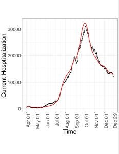
Figure 2: Daily hospitalizations, fitted by the model (red ⎯) and observed (black ⎯)
3.2 Estimation of Latent Compartment
The estimated number of infected asymptomatic individuals (Figure 3) shows a similar pattern with a high point around the beginning of October, and dipping afterwards. There is also a local peak around the end of August. Estimation of this latent, i.e. unobservable, compartment across time is a key feature of our proposed methodology, since this information cannot naturally be obtained from the conventional epi-models.

Figure 3: Estimated number of asymptomatic individuals
3.3 Analogue of Basic Reproduction Rate
One large wave, i.e. a surge in new infections, can be observed from the plot of the proposed analogue of the basic reproduction rate (Figure 4). It measures the transmissibility of COVID-19 at time t and is influenced by spread mitigation efforts. The basic reproduction rate less than 1 indicates a decrease, while greater than 1 indicates a growth in the number of asymptomatic-infected individuals. Its estimate was mostly larger than 1 in the sub-interval, namely from the end of April to the beginning of October, indicating the singular large wave.

Figure 4: The basic reproduction rate ( R0 ) is the rate of growth of asymptomatic-infected individuals.
The plot of the number of daily new and daily reported infections (Figure 5) shows a maximum near October. The black curve plots Ct, the number of observed confirmed cases at time t+1. The red curve plots NI(t), the daily number of new infections at time t, which is calculated as the estimated number of susceptible individuals that become asymptomatic-infected at time t.

Figure 5: Daily new infections observed by the change in confirmed cases, Ct (black ⎯), versus the estimated number of new infections, NI(red ⎯) .
3.4 Transmission Rates
Figure 6 shows the plots of the crude infection rate (CIR) and net infection rate (NIR) . The red curve represents the CIR(t), the ratio of the daily change in the number of confirmed cases relative to the number of confirmed cases at time t+1. The CIR under-represents the infection rate, so the model estimates the infection rate with the NIR. This explains why the black curve represented by NIR(t) tends to be larger than the CIR(t) curve. The NIR(t) is the ratio of the daily change in the number of asymptomatic-infected individuals relative to the number of asymptomatic-infected individuals at time t.

Figure 6: The observed crude infection rate , CIR (red ⎯), and the estimated net infection rate, NIR (black ⎯)
The observed doubling rate obtained from the observed number of confirmed cases (Ct) and its estimate from the cumulative number of new infections (CNI) appear to be very close after mid July (see Figure 7). This implies reporting kept pace with the spread of the disease starting mid July. The doubling rate obtained from Ct is represented as the black curve, and the estimate obtained from CNI is represented by the red curve. It is the inverse of the doubling time at time t. The doubling time is the amount of time it takes to double the amount of infected individuals at time t. The higher the doubling rate, the faster the spread of the infection. The doubling rate reflects the effect of spread mitigation efforts, including social distancing campaigns, improved hygiene, and case tracking.

Figure 7: Doubling rate, Ct (black ⎯) and CNI(red ⎯)
Figure 8 shows the crude and net case fatality rates, CFR and NFR respectively. The black curve represents the CFR(t) and the red curve represents the NFR(t). CFR(t) is given by the percent of total deaths to the total confirmed cases up to time t. NFR(t) is given by the percent of total deaths to the cumulative number of infections up to time t estimated by the model. It is important to note that the formulas of the CFR and NFR are the same, except the denominator of the NFR is the CNI(t) while the denominator of the CFR is Ct . The observed number of confirmed cases Ct will be strictly less than or equal to the estimated cumulative number of new infections CNI(t), and likely much less, therefore the CFR is naturally much larger than the NFR.

Figure 8: The crude case fatality rate, CFR (black ⎯), and the net case fatality rate, NFR (red ⎯).
3.5 Testing and Hospitalization
The daily number of tests and its effect in quarantining asymptomatic but infected people can be judged from Figures 9 and 10. Figure 9 plots the number of tests performed per hospitalization. Tt represents the number of COVID-19 tests at time t+1. Ht represents the number of hospitalized persons for COVID-19 up to time t. This measure is an approximation of the contact tracing intensity. Figure 10 plots the RCCF, the relative change in confirmed fraction. The RCCF measures the change in the rate of currently asymptotic-infected individuals with COVID-19 that are detected through testing and quarantined relative to the rate of detection of currently infected individuals. This measure shows the dynamics of the effectiveness of detecting and isolating asymptomatic-infected individuals from the population through testing. Empirical comparison of Figures 2 and 9 reveals that although the number of daily tests could keep pace with daily number of hospitalized patients up to early July, the growing number of hospitalized people from July to October ultimately outpaced the number of daily tests. The daily number of hospitalizations beginning to decrease in early October was accompanied by the daily testing beginning to increase.

Figure 9: Tt / Ht

Figure 10: The relative change in confirmed fraction, RCCF
Discussion:
In comparison to conventional SIR models which model disease dynamics from the number of susceptible, infected, and recovered individuals, the proposed model also incorporates information about testing and quarantine. It is important to note the following assumptions the proposed model is based on:
- Only an asymptomatic individual who is not either in quarantine or in hospital can transmit the disease to a susceptible individual.
- People who recover from the disease are immune from subsequent infection.
- False positive rate for the test is negligible, so that if somebody is confirmed to be positive, then he/she is assumed to be infected.
- Anybody who shows significant symptoms, whether being in quarantine or not, is immediately hospitalized, and is tested to be positive.
- There is no effective treatment regime for the asymptomatic individuals, and so they recover or turn symptomatic at the same rate regardless of whether they are tested positive (and hence quarantined) or not.
These assumptions are quite general, however, the model could be modified if necessary to adjust for assumptions not met. For example, assumption 2 and 3 can be generalized by adding a fraction of recovered individuals to the susceptible population. Additionally, violations of some assumptions, such as assumption 1, are unlikely to have a significant impact on the disease dynamics. However, the current model does not incorporate impact of vaccination on the disease dynamics, which renders it applicable to the data being studied. Clearly, analyzing more recent data would require using a more enhanced version of the model that includes vaccination effects.
Smoothing was a crucial technique in this model because counts are rough. It was used in the data preprocessing to reduce the impact of anomalies, such as abnormally high counts likely due to incorrect data reporting. Additionally, it was used in the estimation of time varying parameters, which is intrinsic because of the locally weighted time window.
The goal of this study was to analyze how well the proposed model, which has already been used to model data from the United States, models disease dynamics of COVID-19 in Kerala, India. The performance of the model is validated by its ability to capture the large wave Kerala experienced between August and December of 2020, which is visible in the number of hospitalizations, estimated number of asymptomatic individuals, and the basic reproduction rate. The number of new infections estimated by the model appears reliable compared to the reported number of new confirmed cases. This reported number is an underestimate of the number of new infections since not all infections are reported. For example, an individual may be infected with COVID-19, but not reported as a confirmed case of COVID-19 if they are asymptomatic and did not get tested. This underestimate of the number of new infections worsens as the number of asymptomatic cases increases. The plots of testing per hospitalization and RCCF give us an idea of contact tracing intensity in Kerala, and how well it was coping with the pandemic. This model can help evaluate the effectiveness of measures used in hopes of reducing disease spread, such as social distancing, curfews, and mask mandate. The proper response to a pandemic is a controversial topic, and this model can help make informed actions in future pandemics. Just as this model was originally used on data from the United States and applied here to data from India, this model can also be applied to other regions, as long as the necessary data is available, preprocessed, and cleaned.
It is important to note that variants can have a strong influence on disease dynamics. For example, the omicron variant of the original SARS-CoV-2 strain is more infectious and spreads faster [8]. Additionally, the current state of this model is most applicable to a pandemic in which a vaccine has not yet been developed, which can be a big chunk of a pandemic since vaccine development takes time. The first cases of COVID-19 were detected in December of 2019, and a vaccine wasn’t approved until a year later in December of 2020 [9, 10], but even then the vaccine supply was limited and was distributed in phases, prioritizing those most at risk [11]. Because vaccinations impact disease dynamics, a potential next step is incorporating data about vaccinations into the proposed model [12].
Acknowledgements:
Thank you to Sruthi Rayasam for scraping the data from online, Satarupa Bhattacharjee for helping with the R code, and Dr. Debashis Paul for supervising this project.
References:
- World Health Organization. WHO coronavirus (COVID-19) dashboard. Accessed April 11, 2022. Available from: https://covid19.who.int/
- World Health Organization. 2022. Global excess deaths associated with covid-19, January 2020 – December 2021. World Health Organization. Accessed May 13, 2022. Available from: https://www.who.int/data/stories/global-excess-deaths-associated-with-covid-19-january-2020-december-2021
- Runwal, P. 2021. How India’s covid-19 crisis became the worst in the world. Science News. Accessed April 16, 2022. Available from: https://www.sciencenews.org/article/coronavirus-covid-india-crisis-social-distancing-masks-variant
- Bhattacharjee, S., Liao, S., Paul, D. Chaudhuri, S. 2022. Inference on the dynamics of COVID-19 in the United States. Sci Rep. 12(1): 2253. https://doi.org/10.1038/s41598-021-04494-z
- Babu, J., Shukla, A., & Bharath. Covid19-India API. Accessed April 21, 2021. Available from: https://data.covid19india.org/
- C-DIT. Kerala : COVID-19 Battle. GoK Dashboard. Accessed June 4, 2021. Available from: https://dashboard.kerala.gov.in/covid/index.php
- Google. Covid-19 Community Mobility Reports. Accessed August 9, 2021. Available from: https://www.google.com/covid19/mobility/
- Centers for Disease Control and Prevention. 2022. What you need to know about variants. COVID-19. Accessed April 16, 2022. Available from: https://www.cdc.gov/coronavirus/2019-ncov/variants/about-variants.html
- U.S. Food and Drug Administration.. FDA Approves First COVID-19 Vaccine. Accessed June 16, 2022. Available from: https://www.fda.gov/news-events/press-announcements/fda-approves-first-covid-19-vaccine
- Centers for Disease Control and Prevention. 2022. CDC Museum Covid-19 Timeline. Accessed June 16, 2022. Available from: https://www.cdc.gov/museum/timeline/covid19.html
- California Department of Public Health. Covid-19 vaccine prioritization recommendations for moving through vaccine phases and tiers. Accessed June 16, 2022. Available from: https://www.cdph.ca.gov/Programs/CID/DCDC/Pages/COVID-19/Vaccine-Prioritization.aspx?TSPD_101_R0=087ed344cfab2000b4d56b612d8caafb7743db82d9ff978793d54888b3c213b891734b5b4e6868b0087aa92767143000f5f590c2e053b6fe510cb7cedbfa962f4b18412db1954061d6f01003ae226244940e863d42ef53db7a5f6abb6d403af1
- Chen, X., Huang, H., Ju, J. Sun, R., Zhang, J. 2022. Impact of vaccination on the COVID-19 pandemic in U.S. states. Sci Rep. 12(1): 1554. https://doi.org/10.1038/s41598-022-05498-z